Your children deserve nothing less than a magical childhood. We’ve…
Getting – and Keeping – That Photo Shoot Look with Photos on Canvas
It’s the eternal problem. You see something in a magazine or online, whether it’s a makeup look, a home renovation project, or interior design like this – and you try to replicate it. You can see it in your mind clearly, and even see the pathway to achieving it in real life.
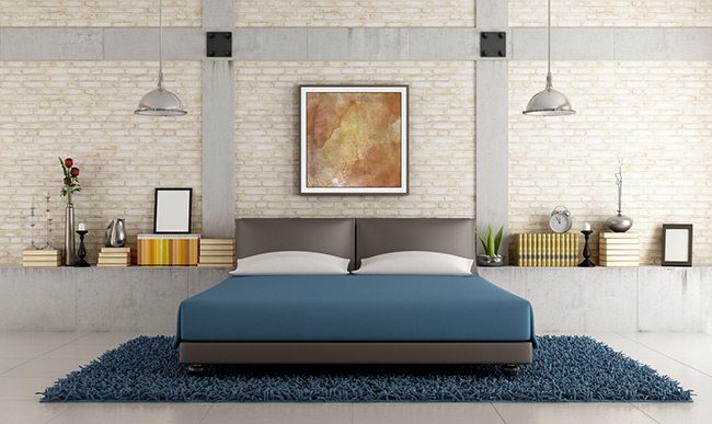
Then, things go off the rails. Whether it’s a lack of carpentry skills, an inability to grasp the subtle colour palette, or a budget limitation (although many design tricks, like photos on canvas, are eminently affordable) – you wind up with what professional designers call a Hot Mess instead of a photo-shoot ready look. The problem may not be due to a lack of funds or even a lack of creativity or taste. It might simply come down to a lack of one of the three fundamentals: Clean lines, open floors, and lack of clutter.
Clean Those Lines with Photos on Canvas
Take a look at the photos linked to above again. They’re photos in a magazine, of course, so they don’t necessarily reflect real-world living, but notice how the lines are carefully arranged – not perfectly balanced, which would be boring, but in harmony, creating a pattern that the eye enjoys following.
You may not be able to go out and buy all new furniture, of course, but what you can do is create new sightlines by removing some unnecessary furniture, perhaps, and then adding in some pops of colour and new lines with photos on canvas. Art on the walls are lines in your visuals, and by added a few to complement your furniture you can add visual interest to just about any room.
Open Up the Floors
Look at the photos in the link again and notice something: The things on the floors are there on purpose, and the floors are mainly open. The more stuff you have on your walls and floors, the smaller and more crowded the room will appear to be when people walk in – even relatively large rooms can start to feel tight and claustrophobic.
Start by removing everything from the floor, and only put back what absolutely needs to be there. Unless it has a reason to be on your floor, find another place for it. Be ruthless. Every centimetre of open floor you reclaim will make your room feel larger, so be creative.
Storage, Storage, Storage
This ties into the last point: There’s no clutter in magazine photos of rooms. There are things – often quite a number of them – but no clutter. Clutter is the dumping ground of stuff that just accumulates. You can tell it’s clutter with a glance because it doesn’t have any pattern and it doesn’t serve the design of the room.
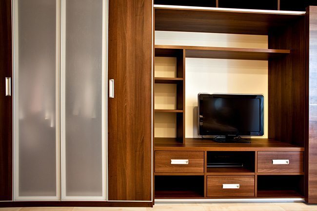
Storage is the key: Hidden storage is the room designer’s best friend. A cabinet built into the wall will allow you to keep objects that are needed on a regular basis but don’t add to the room design within reach, allowing you to keep your room magazine-shoot ready without taking away from the room’s liveability.
You wouldn’t want to live in the static, sterile rooms seen in magazines – but you do want to reference that clean, professional feel. Choose your furniture, layout, and images for wall art carefully – then click here and we’ll handle the latter for the perfect finishing touch.

