Being stuck at home makes us hyper-aware of just how…
A Guide to Abstract Art on Photo Canvas for the Rest of Us
Almost everyone in the world wants to live in a visually pleasing space. Whether it’s sixty square metres or a sprawling mansion, people always want to enjoy their surroundings. If you can afford to hire a designer and a contractor, gut your home, and have it put back together according to aesthetic principles, great! If not, though, you can still achieve an amazing look and feel using just your own sense of beauty and affordable options like paint, antique furniture, and art pieces printed onto a photo canvas.

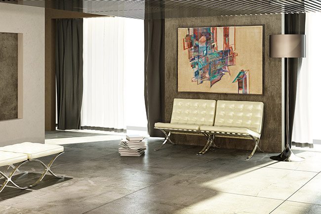
Abstract art is a popular choice for decorating a room, because the lack of solid, real-world subjects and the freedom of line and colour within the pieces make them easy to integrate into any design. But using these pieces intelligently requires a little more thought and planning. Here’s a quick guide to using abstract art to the best advantage in your interior spaces.
Choosing the Right Art for Your Photo Canvas
First comes the chicken and egg question: Do you match the art to your furniture and other decor, or the decor to the art? Artists, naturally, get a little upset when they hear that you chose their piece to hang on your wall as a high-quality photo canvas because it matched the upholstery on your couch, but for most of us ditching all of our perfectly-usable furniture in order to match a great painting on the wall doesn’t make economic sense.
Choosing a painting then comes down to two aspects of the room: Colour and line. Choose a piece that complements the colours and lines in the room. Start off simple by assessing the furniture: Is it all straight lines and right angles, or are there curves and oddball lines? What’s the colour palette – just be basic: Red, green, yellow, etc. No need to worry about whether the walls are technically Pumpkin or Squash.

Positioning and Placement
What gets newcomers to the design game is that placing the art itself is often very obvious – putting your painting on the wall over the couch is often the perfect spot, and while ingenuity is often a triumph when it comes to design there’s no need to reinvent the wheel.
That obviousness makes people think this design stuff is easy, but the fact is when the placement of your wall art is obvious you’re in a prison, because you’ve just lost most of your design options. Luckily, there are some strategies you can use to compensate:
- Move the Pop: That pop of colour you’re going to use to tie into the awesome painting you’ve chosen? Doesn’t have to be in the same room. Consider your sightlines: An accent wall in the next room through an archway can be more powerful than the obvious and expected colour pop in the same room.
- Mimic the Painting: If your chosen wall art will sit above a couch or other piece of furniture, consider recreating the painting’s lines and colours using the furniture and pillows. Even a rough approximation can create a powerful effect that makes it look like everything in the room was made custom.
Abstract painting’s lack of real-world detail often makes us think it can be used in any way we want – that there are no rules. But there are, they’re just more difficult to see. When you’ve had a moment to think and you’ve chosen your abstract for the room, click here and we’ll handle turning it into stunning wall art to carry out your design vision.


