One of the great ways to use canvas printing to…
Minimalist Decorating with the Canvas Print
Interior design and decoration isn’t a science. Yes, there are measurable specifics involved – dimensions of a canvas print on the wall, for example, or angles, thicknesses and pile and thread counts – but deciding what works and what doesn’t work is often difficult or impossible to explain without referring to a wholly interior and private sense, an innate ability to make connections.

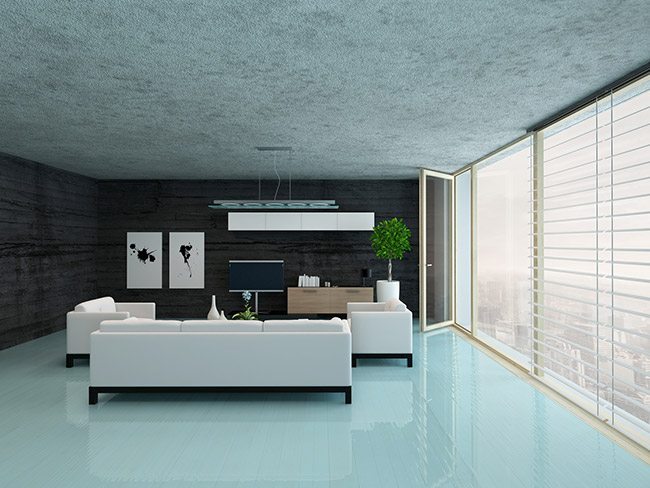
That’s one reason why interior design has so many directions and camps of thought, from shabby chic to craftsman-inspired to ultra-modern. None of these approaches is better or worse than another – it’s just a question of taste. One of the most popular modern modes of decorating is minimalist, which, as its name would suggest involves a “less is more” approach. People into minimalist design don’t want clutter, they don’t want every inch of a space to be crowded with ideas.
The Operative Word Being “More”
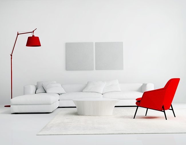
That doesn’t mean they don’t want beauty and colour – a common misconception when thinking about minimalist decoration is to take the whole “less is more” concept quite literally and envision vast empty spaces with white furniture and walls. Nothing could be further from the reality – good minimalist design isn’t about deleting everything, it’s about having a good reason for including everything.
Canvas Print Minimalist Design Tricks
Getting colour and texture into a minimalist design is, however, a bit more of a challenge than in other design modes. One great idea is to use the reliable old canvas print to get some colour into the space by putting a commonly used decorative object on the wall instead. For example, in a room where a messier design concept might include a vase of flowers, a minimalist design puts the flowers and their pop of colour on the wall. The lines stay clean, the surface uncluttered, but you keep a traditional aspect of room decoration in place in a new, fresh way.

This can be repeated in many ways. Family photos – on the wall instead of framed on the tables. Even things like cushions normally used almost exclusively as colour pops in the room can end up on the walls as unusual (and much-discussed) art pieces that keep the room itself clean and light, while still bringing in the detail that makes the otherwise muted palette and monochromatic impact work.
Very few things in design and decoration are simply one thing. Every approach has folds and hidden aspects that serve as the tiny grit of contrast to the rest of the design that makes everything come together and pop. That’s where the true genius of a design makes itself known.
If you’re working with a minimalist palette in your room, think about the things you normally would have on the floors and other surfaces that might work better in abstract form on the walls. When you’ve got the idea, click here and we’ll take care of producing them for you!


