It’s difficult to say, sometimes, whether a bad retail experience…
Wall Art Layout and Furniture: Good Advice
Sometimes it seems like interior design is just a nesting doll of challenges. First you have to choose every other aspect of the room, from the colour palette to the theme, and then you have to fill that room with objects and wall art that fit into both. Then there’s floor plan and furniture acquisition and placement, and the inevitable period of regret when you feel like none of your decisions are coming together into a whole.

And finally, when you’ve got just the right ideas for everything including the photos you’ll use to make canvas prints for your walls, you realise you have one more challenge: How to arrange those art prints on the wall so that the room feels balanced and planned and not just filled with random shiny things you enjoyed. What many people miss is that the easiest way to guide your wall art placement is to look at how your furniture sits in the room.
Wall Art Guide to Lounge Suites and Couches
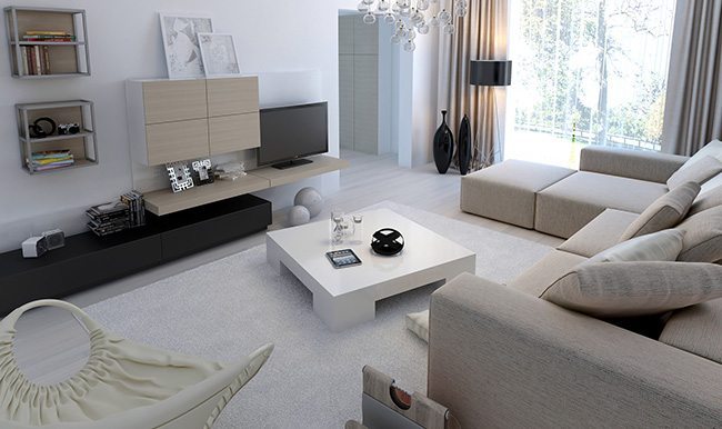
A lot of rooms will feature one basic design concept: The large-scale lounge or couch with art on the wall behind it. Whether you’re working with canvas prints or aluminium or glass prints, the key here is to use your furniture as a guide:
- Scale. If your lounge is a huge, puffy thing designed to seat eight people and envelope them in cushions and upholstery, a single large-scale piece of wall art behind it will make sense visually. Chopping your art into smaller pieces will make the wall feel busy, and make your large-scale furniture seem overbearing.
- Lines. A sectional, on the other hand, no matter how it’s arranged, cries out for more individual pieces of wall art, arranged so they each sit above a section. This gives a sense of intimacy to each seating area, as if invisible walls separated the spots.
- Sight Lines. Finally, consider how the room will be used. When people are seated on your couch, what will they see? Will anyone be seated across from them? Make sure to decorate the other side so every view has something to look at.
The Busy Rule of Thumb

Often guides to wall art layouts assume that the room you’re planning is some sort of modern dream: Clean lines, lots of space, modern furniture. We all know how often that isn’t true: Rooms often get a bit chaotic and messy as we bring our personalities to them, and sometimes we just like a more old-school bric-a-brac approach to decor.
Planning wall art in a busy room is a question of taste, but it comes down to a simple question: Do you want to go with the flow of chaos, or contrast it? The question of contrast versus complement is one of the most basic in design: You can underscore the chaos by adding larger canvas prints and such to your walls, contrasting the simple lines and clean look with everything else, or you can go ‘all-in’ and make your chosen wall decoration as complex and scattered as everything else. Both can be powerful approaches – as long as you commit to one or the other. A mix of approaches will just be a mess.
In the end, all that matters is your own reaction to your room. And wall art can always be changed, so if you realise you’ve made a mistake you can usually fix it. When you think you’ve got this question nailed, click here and we’ll help you accent your room with appropriate and spectacular art prints.


